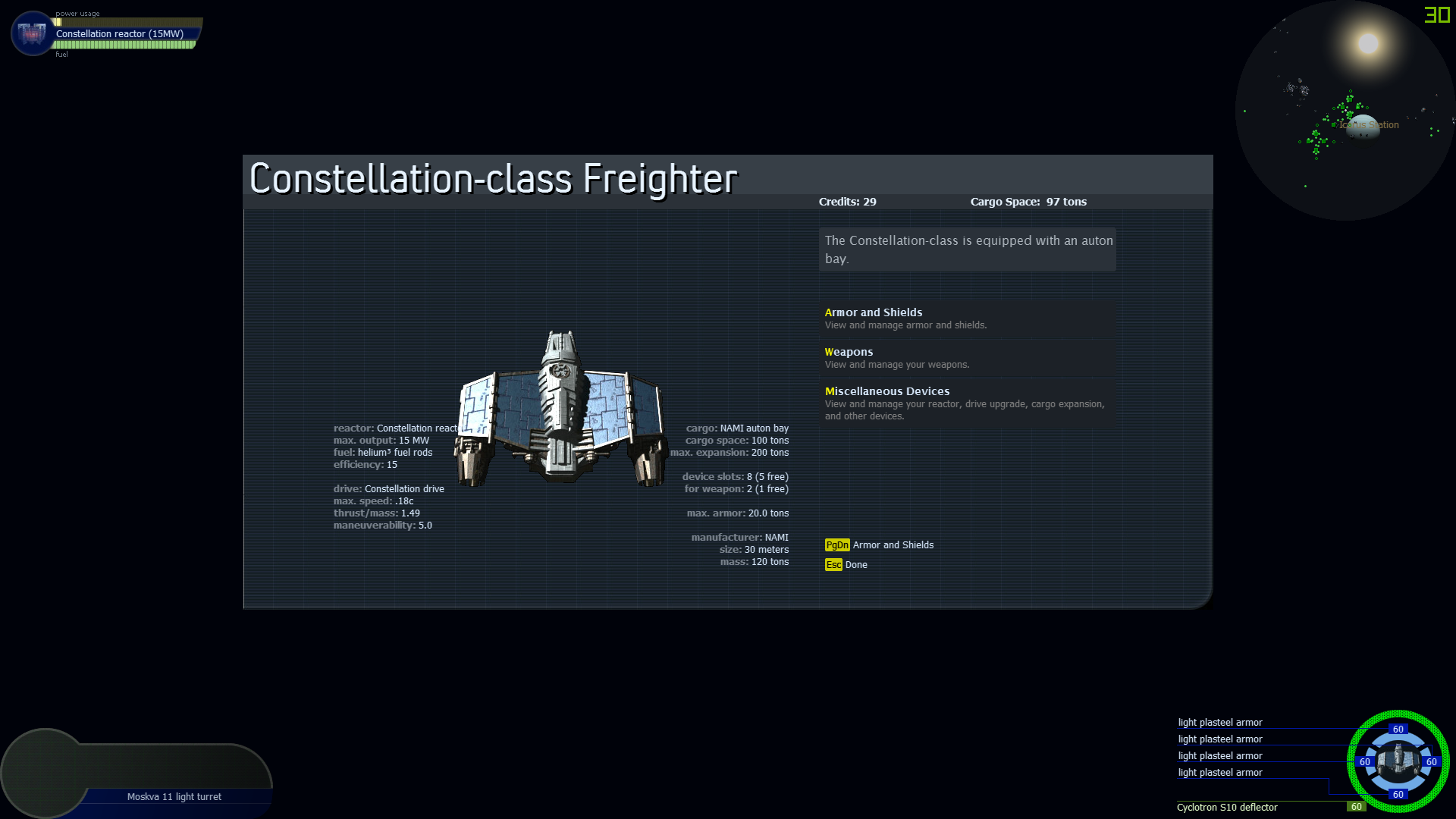
Looks like the left column of text should be moved farther left (and perhaps the image by a little, too). Also, text should flow to a new line if it doesn't fit in a box that doesn't overlap the ship image box.

StatScreenOverlap.png
nms 24 Feb 2018:
Fixed in 1.8B1. The image is less saturated and text appears on top of it if they overlap.
Resolve
Archive
Reopen
Create
Edit
Save
Attach File
Cancel Edit